Community Curated: Preston Park Exhibition
On the 7th of April this year, we installed a small (but hopefully impactful!) exhibition featuring some of the protest posters created by our brilliant participants.
The Deliberate Ink project has always placed value on the process itself—taking time to reflect, and using both traditional and contemporary print techniques to engage in a dialogue with the past. Yet, seeing the posters installed as part of the exhibition reminded us that the final artefacts themselves have an equally important role to play. They do more than reflect the process; they actively contribute to shaping public attitudes toward women’s political protest, the ongoing struggle for gender equality, and the broader conversation around how we communicate our ideas meaningfully in the cacophony of our digital age.
Creating the labels for our posters was a really fulfilling part of that process. In the workshops we experimented with different rhetorical effects and explored the impact of type weights and arrangements, but installing the exhibition involved taking a step back to consider both the posters intended and unintended messages, as well as the impact they might have on visitors. Taking the time to write the interpretive panels opened up new meanings and potential avenues for interpretation.
Take for example, the poster which features the word ‘Do’, with the letter ‘o’ rendered as a female gender sign. On the surface, this design is a relatively simple call to action, but actually, the action it invites the viewer to take remains ambiguous. Is it a call to inspire women’s rights activism, an invitation to pursue self-actualisation, or something else entirely? This ambiguity is interesting.

Protest poster on pink paper. Depicts the word ‘Do’ with the O rendered as a female gender sign.
Likewise, in another poster, by merging the words ‘power,’ ‘voice’, and ‘freedom’ into an oval design, the poster implies that individual liberty is not merely about the absence of physical restraint, but also encompasses freedom of expression. The word ‘voice’ takes centre stage, but is intriguingly enclosed by the stronger, more dominant type of ‘power’ and ‘freedom’, which is something we perhaps might not have considered before.
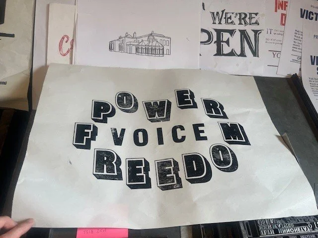
Protest poster on white paper. Features the words ‘power’, ‘voice’ and ‘freedom’
We didn’t have a lot of space to display the posters (one large glass cabinet and some adjoining wall space) so we used fishing wire to suspend them at different heights, facing the posters back to back. This allowed us to capitalise on the vertical space and created visual interest all the way around the cabinet. Personally, I love how the spot-lighting brings out the graininess of the ink and the texture of the paper.
As well as the posters themselves, project collaborators Marcus Diamond and Ellen Mather created this short process video documenting Deliberate Ink’s three interconnected workshops. It runs on a loop on the wall opposite our display and I think it really helps to give a sense of the experience of participating in the project.
We’ve had some really lovely responses to the exhibition so far. My favourite has to be these amazing feedback postcards left by some younger visitors. The display itself is modest in scale, but it’s so nice so see that it has sparked feelings of pride or inspiration about women’s political expression, however fleeting that might be!

Two feedback postcards. The first says ‘this exhibition has made me feel magical’ and the second, ‘This exhibition has made me feel proud that we are fighting against these things’. Both are in children’s handwriting and are accompanied with drawings of girls.
The exhibition is located in the ‘Community Curated’ space on the ground floor of Preston Park Museum and will be on display for the next couple of months. If you have the time, please do take the time to visit and don’t forget to leave feedback!


